
Responsive Design
Responsive design ensures that your site looks stunning and functions properly on devices of all sizes. With mobile users making up over half of today’s internet traffic, you need to able to reach everyone without doing doubling your cost.
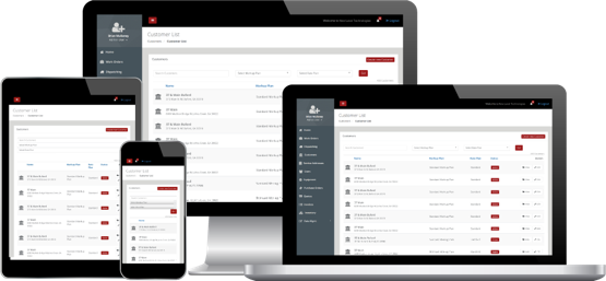
Responsive web design or RWD means that the page uses the same URL and the same code whether the user is on a desktop computer, tablet, or mobile phone – only the display adjusts or “responds” according to the screen size. Google recommends using RWD over other design patterns.
Desktop or Mobile?
Both! Back in the day, mobile devices were accommodated by making separate mobile sites with scaled-down navigation and limited content. More and more of today’s mobile users insist on your full site’s functionality in order to remain engaged.
Now every page on your site can look beautiful on any platform.
Get the Ranking you Deserve
It’s not just humans that get frustrated with limited usability. Having separate pages with identical content is frowned upon by search engines. Let us help you eliminate separate “mobile” versions of your content which make link sharing cumbersome and ruin your search rankings.